

The project is a part of Google UX Design
Professional Certification Program
Project Name:Purely Free
(An allergen free bakery App)
Project Duration: 6 weeks
Project Vision
This case study outlines the design process for an intuitive and user-friendly mobile application for customers seeking Dairy & Allergen-free bakery options. The app should allow users to easily search and find Dairy & Allergen-free bakery products, view ingredients, place orders, and track deliveries in real-time.
Problem
The “Purely Free” is a bakery that specializes in producing allergen-free baked goods. The bakery has a loyal customer base, but the business owner realized that they needed to improve their customer experience to compete in the market. To achieve this, the bakery decided to invest in a mobile application that would allow customers to order online, view the bakery's products, and receive updates on special offers and events.
Process
The first step in designing the app was to conduct research on the bakery's customer base. This involved conducting user interviews, creating user personas, and analyzing the bakery's user data. Through this research, we identified the following insights:
Many of the bakery's customers have food allergies or intolerances.
Customers prefer to order baked goods online, rather than visiting the bakery in person.
Customers want to be able to see the ingredients and nutritional information for each product.
My Role & Responsibilities
Role: UX designer
Project Duration: 6 weeks
Platform: Figma

Product Goals
Based on these insights, we identified the following design goals for the app
Provide an easy-to-use ordering system that is accessible to all customers.
Clearly display the ingredients and nutritional information for each product.
Provide a personalized experience that caters to each customer's individual needs.
Design Approach
Employed the design thinking process to empathize, define, ideate, prototype & test solutions for creating an effective Dairy & Allergen-free Bakery App. The process was carried out in the following phases product definition, research, analysis, design & validation.

RESEARCH
Assumptions
Declaring the assumptions was imperative to the process because it would allow to decipher what was actually accurate and what wasn't.
Business Goals: How the business strives to succeed in the market
Users: Who is our audience? (Behavioral Archetypes, personas, etc.)
User Goals: What goals will the users want to accomplish when using the app?
Potential Features: How might we bridge the gap between our users and their goals?
Key Market Insights

The global allergen free food market size is anticipated to reach US$ 75.67 Bn by the end of 2030. According to a study by Future Market Insights (FMI), the market is expected to depict a strong positive growth trajectory at 9.0% CAGR between 2020 and 2030.
3%. Of adults and 6% of children have allergies.

Business of Apps in their “Food Delivery App Revenue and Usage Statistics” article projected that the global market for delivery apps will increase to $120 billion by the end of 2021 and reaching $300B by 2027
USER RESEARCH
Primary Research- As the product is in the brainstorming stage, I decided to conduct a foundational research to empathize with users, understand their needs, and inspire new design directions and priorities. Hence I did interviews, survey customers with food allergies and dietary restrictions to conduct foundational research based on qualitative observations. This helped me discover the following pain points:
1 Allergen-free baked goods available only at few locations in the city making it inaccessible for majority of people.
2 Lack of awareness on health benefits of using Allergen-free products.
3 Very few to none bakery brands selling these products in most regions apart from big cities.
4 Very limited home delivery options to get these products.
5 Most products available on the market are exposed to cross-contamination thus posing risk to people with strict dietary restrictions.
6 Difficulty finding reliable information about allergen-free products.
The research revealed that most of the current consumers are people with allergies or people who have moved to vegan diet. Customers expressed frustration with the lack of transparency in the food industry, especially when it comes to labeling and cross-contamination.
Secondary Research- I also conducted a Competitive Audit to better understand the market for the scope of this app before starting the design process.


Understand the User
Meet the Users

User Journey Map
Next step was to create User Journey Map to get better understanding of how the user feels while trying to complete the task and achieve their goals.
In the next step the most common themes in the user foundational research data were recognised and the users whom personify those themes were grouped under a specific persona - a fictional user whose goals and characteristics represent the needs of a group of users. There were 2 main USER PERSONAS that the app needed to solve the problem for. The idea was to understand users within their social, emotional and physical context.

After identifying common threads between potential users, i was able to create Empathy Maps for 2 different types of users. I thought about their journey in searching the bakery app that suits their dietary need and their pain points. What difficulties they are currently facing and their specific needs? what were the things that were working well for them? By Empathizing with my potential users i was able to identify their pain points as well as their wants and needs for the app.
User Personas I Empathy Maps l User Story l User Journey Maps
Storyboard
There are many possible scenarios my persona would find herself in. I had to understand the what, why and, how to specifically cater to her needs and goals. Storyboards equipped me to better understand the research data and possibly prioritize features; bringing about a visual map of where to start designing.


DEFINE THE PROBLEM
Problem Statement I Goal Statement I Business Model Canvas
Based on the above user research and analysis, I understood what were the problem users were facing which further helped in developing goal statements & value propositions to streamline the process of developing the product.

Problem Statement
As a consumer with allergies and diet restrictions, i want to use an app that is easy to use and not only caters to customers with dietary restrictions but also educates and informs them about the ingredients used in each product.
Goal Statement
To design a user-friendly mobile app for an allergen-free bakery that offers a wide range of baked goods suitable for people with food allergies, intolerances, and dietary restrictions. The app should allow users to easily browse through a variety of products, filter options based on their allergen needs, and place orders for delivery or pickup. We want to create a product that can compete in the market, improve sales, and increase customer satisfaction.


Business Model Canvas
IDEATE THE SOLUTION
Based on the above Analysis and detailed research the next step was to create an Information Architecture and User Flow for the app. Mapping the IA also involved thinking about the flow. There were particular challenges pertaining to it being an App. The homepage has a profile overview making it easier for the user to view all their info regarding account detail and order history upon signing in.


How Might we?
After researching and empathizing with the potential users, i felt it was fairly easy to envision their experience and potential challenges. I created “ How Might We” statements to ensure that i addressed all of these concerns.

Ideation- HMW I Information Architecture I User Flow
DESIGN
Paper Sketches
While doing paper wireframes a certain elements which I was happy with were marked with a star and some of those elements were kept in the final design – like action buttons ( pickup and delivery), 5 elements bottom menu bar, news and campaigns carousel and featured products.

Lo-Fi Digital Wireframes
Armed with the main flows next step was developing app screens based on user needs. It was time to start thinking about how it all came together.


Hi-Fi Digital Wireframes
Based on the user feedback shown below the Low Fidelity wireframes were further developed into Mid Fidelity and Hi- Fi wireframes and mockups keeping in mind the UI design kit and Accessibility considerations.
TESTING
With the key flow ready, I wanted to evaluate users’ interaction and experience with the bakery app to complete certain tasks and understand their pain points, behavior with the product, negative and positive emotions to refine the final product making it more usable and accessible.
Testing was done remotely & in person. The findings have been listed in a feedback grid.


Usability Test I Feedback Grid I Iterations
Usability Testing
Feedback Grid
The feedback grid helped me categorize my findings from user testing into 4 categories:
What worked well
What needs to change
What were the questions users had?
Were there any new ideas or suggestions that could be incorporated in the future?

ITERATIONS
I addressed the “Needs to change” column from the feedback grid. The iterations have been listed below with relevant descriptions.
A search bar has been added at the top.
A Fav icon has been added to mark the item as Favorite/ Save for later
“Change to pickup” & “Edit delivery address” are added on checkout page.
“Track Order” & “Feedback” features are added on the confirmation page.
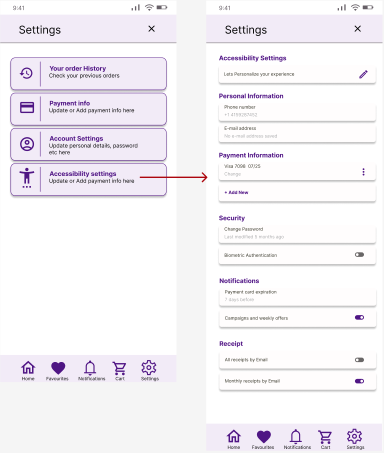
A detailed settings page was made based on the user feedback who wants all the information upfront.

Mockup screens & Features

Homescreen
News and campaigns in top carousel;
Journey leading action buttons;
Featured products carousel divided in categories;
Bottom navigation icons
Product screen
Shopping cart/Bag screen
High resolution image carousel;
Bakery menu divided in 5 categories;
Product sections with action buttons;
Filter menu button.
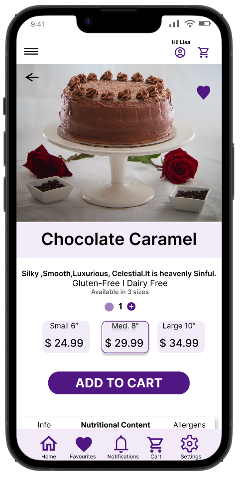
Product image on a neutral background;
Change amount and add to order button with price;
Product information
Nutritional content
Allergens
Allows users to change amount of products, remove a product or add to favourites;
On this screen user can add a coupon code to pay with;
A user can get to change their mind and choose again if they want to pick up their order in the store or get it delivered.
Allows users to save a delivery address they use often and give it a name- home, work.


Custom order screen
Menu screen
Account setting screen

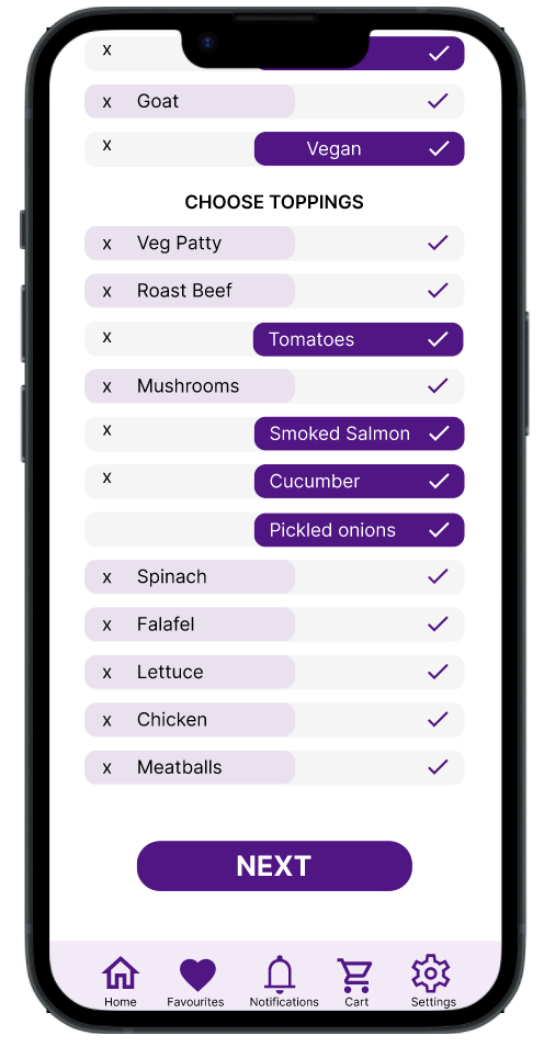
The sandwiches category also allows users to make their own sandwich by choosing the ingredients they love the most.
This feature was created with Sarah persona in mind.
Choose to allow biometric authentication;
Send receipts by email after every purchase or once a month.
Detailed accessibility settings.
Accessibility considerations
The application is designed with high color contrast and a reader friendly design for people with visual impairment
Most action buttons as well as the navigation menu is placed in the lower 2/3 of the screen allowing comfortable one hand use.
Features are added in the accessibility settings to make the app more user friendly to a wider customer base.
Takeaways and next steps
This being the very first app I designed, in hindsight, there are a bunch of things I would do differently or rather add to the existing app to improve it.
Like a section for recipes that allows the user to buy all the ingredients, tools, equipment, etc. from that recipe with a click of a button (with customization/edit option)
A community section for users to interact with one another and get their doubts/queries answered which would not only improve the engagement but also act as self-service, thereby, reducing the cost of customer service.