

Carbon Neutral
A mobile app empowering people to offset carbon emissions their way
UX/UI . Branding . IOS


Project Overview
The Carbon Neutral app has a simple carbon calculator to help you track and manage the emissions from your everyday actions. You can recalculate your impacts to the footprint as often as you want & on-the-go. It aims to encourage people to adopt a climate friendly lifestyle with helpful tips. This platform provides you with a learning experience tailored to the challenges of sustainable lifestyle applications and programs. There are many categories of life where our daily actions results in CO2 emissions and this app can help users to reduce their carbon emissions from everyday choices.
I ultimately strive to enable everyone at the business, individual and community level to drive real change!
Problem
It is difficult for people to make sustainable choices even if they want, which affects climate change. The problem is:
How can an individual be aware of their impact on climate, and how to minimize it?
How can we make carbon offsetting more accessible?
Solution
Carbon Neutral helps users monitor their daily carbon emissions and provides tailored recommendations unique to each user, offering a comprehensive approach to reducing their overall carbon footprint by suggesting self-doable actions or donations to verified offset programs. The end-to-end mobile app also aims to connect the users with the latest news, new eco-brands, government policies & rebates, etc.
Goal
My goal is to design a simple app that will help individuals understand how much carbon dioxide (CO2) they emit from their daily activities. The app will also recommend ways to offset their emissions in a practical and direct way. With this, I assume more users will feel inclined to change their habits for the better.
My Role & Responsibilities
Role: UX designer
Project Duration: 6 weeks
Platform: Figma, Adobe XD

Design Process
Following a User-Centered Design process allows me to ensure that my design decisions are always supported through user research, usability testing and directed towards users. The actual procedure, however, was not as straightforward as the diagram below suggests. To arrive at the final solution, many iterations between the phases were required.

Discovery Research
I started with product research including checking what Apps or Websites currently offer some (if not all) of the features appropriate to these apps themselves.
After compiling a list of possible services, I evaluated each of them.
My next step is to take an in-depth look at these competitors. My biggest question is why and when would someone want to track their carbon footprint, and what are the advantages of doing so?
For this reason, from my research on similar products, I started trying to make questions to study user habits and most importantly, I wanted to find out if they care about their carbon footprint? and thinking about what kinds of questions will make the interviewee think realistically about their carbon impact without getting contrived answers.
The plan was to…
Know what the users need for a “carbon-neutral” living.
Understand how aware they are of their lifestyle and current situation.
Find what apps they currently use (if any) & how satisfied they are.
Learn their needs and wants and interests regarding this.
Desk Research
Carbon offsetting can be done in many ways including but not limited to-
Funding carbon offset programs that do the work.
Creating self awareness to one’s lifestyle and learning how to
consciously live carbon-neutral or carbon-positive.
Educating and empowering communities.
Voicing out/supporting Government’s climate action call.
Holding corporates accountable… etc
With Google recently adding changes to their apps like suggesting the most fuel efficient routes, adding carbon emissions for flight routes etc, the companies are working on raising the general public awareness of the current scenarios.

Quantitative research
I conducted an online survey in which 15 people who were mostly in the the target group participated. The focus was to understand their mindset, views, biases and also to get a sense of topic and industry i was dealing with before heading to the next part of the research. The results from the survey are as below.


User Interviews
1:1 interviews were held via zoom with prospective users. They were asked about the current products used for this goal (if any) and to prioritize certain features offered by direct and indirect competitors based on their needs. The insights from the user interviews are shared below.
100% say they’re aware & interested in taking action against the current global crisis.

Competitive Analysis
I compared the competitors & their offerings; what they provide and what they lack feature-wise. These features are chosen based on their importance in helping us aim for an actionable solution. Some of these were suggested by research participants and have been added on.
Findings
Market trends suggest that companies are working intensely to raise public awareness on the current climate situation (eg. Google recently suggested the most fuel-efficient routes, adding carbon emissions for flight routes, etc).
With most apps offering subscriptions, the current market is only for the 30% who are willing to spend up to $20/ mo.

What about the rest?
This is where I begin to question and explore solutions that don’t just involve spending. I asked the users what they needed here. Inferred from the 1 on 1 interviews users would be interested in an app that would...
Calculate their carbon emissions based on individual lifestyles.
Analyze problem areas and suggest eco-friendly changes.
Show articles, documentaries, news, and petitions on what’s happening.
Daily reminders/ prompts to make it habitual and accountable.
Aid in donating (Optionable) to offset programs.
Reward conscious actions.
Connect with others on a similar journey.
Meet the Users
PERSONAS I EMPATHY MAPS I STORYBOARD
Personas
The data gathered during the empathize phase revealed two types of users. There are two types of users: one who is fully informed about climate change and the other who is partially informed. They both want to make sustainable choices, but their requirements differ. These findings form the foundation of our personas.
Empathy Map
Storyboard
There are many possible scenarios my persona would find herself in. I had to understand the what, why and, how to specifically cater to her needs and goals. Storyboards equipped me to better understand the research data and possibly prioritize features; bringing about a visual map of where to start designing.


Define- The problem
As a climate conscious person how can we enable and motivate other individuals to track their carbon emissions and manage their impact on the climate?
Anna is a marketing professional and climate change advocate who need a climate app that will allow her to keep track of her carbon footprint because she wants to slow her impact on the world
Brainstorming
The generation of different ideas during brainstorming sessions was critical in determining the design direction and key features of Carbon Neutral app. For this i conducted a “How Might we” exercise to come up with as many possible ideas keeping in mind the users needs and wants. Some of the ideas during HMW are below-

Ideate the Solution
How Might We I Information Architecture I Business Model Canvas


Information Architecture
After understanding the user mindsets and the actions and features they would like to access in the app, the Information architecture was formed aligning that and the needs of the App’s vision.
The IA for the App is shown with the help of - Site Map & User Flow
The Solution
With services like Amazon making it easy to search and buy anything through a device; Carbon Tracker had to provide equivalent if not more options for the user to switch up. The site map became expansive as the departments grew (food, transport, home, pets, outdoors, etc).
Mapping the IA also involved thinking about the flow. There were particular challenges pertaining to it being an App primarily. The home page was a profile overview making it easier for the user to view all their important updates immediately after signing in. The other primary navigations included “Discover” and “Community” were based on the majority of users’ wanting to explore and connect with like-minded people.
Site Map

view full SITEMAP here

Business Model Canvas
Carbon Neutral app’s business model canvas explains how this would work as a profitable & sustainable business. We keep up the revenue stream, working with key partners and giving free access to the users. A business model that is profitable without giving up on climate change.

User Flow of App
Design
Paper Sketches I Lo-Fi Wireframes & Prototype
Sketches- The idea was to keep it simple and understandable for the user. I began sketching screens for the onboarding questionnaire since they might have various input styles and seemed challenging at the time.


Low-Fidelity wireframes- Developing the sketches into wireframes involved learning about the IOS requirements. Users have to answer the onboarding questionnaire when entering the app for the first time. This could be an overwhelming experience. I decided to keep the interface simple and offer an option to skip the questions if needed (the result would be more generic).
Explorations
The home screen (shown below) is the profile page and includes all the user’s updates and status. The challenge here was to arrange them all hierarchically and keep them uncongested.
“Choose to offset” and “Donate to offset” are the main calls to action and have been placed at the top. Above these is a card showing username, rewards, and an offset tracker for quick viewing. Other segments like “Daily reminders”, “Challenges”, and “Committed actions” are aimed to help the user consciously build a routine and make offsetting a habit.
This was the rough coming together of all my ideas to view the flow.


Wireframes: App launch, sample questionnaire & sign-up screens
Testing
Usability testing I Feedback Grid I Iterations
Usability Testing- With the key flow ready, I wanted to evaluate users’ interaction and experience with the Carbon Neutral app to complete certain tasks and understand their pain points, behavior with the product, negative and positive emotions to refine the final product making it more usable and accessible.
Testing was done remotely & in person. The findings have been listed in a feedback grid.
Feedback Grid
The feedback grid helped me categorize my findings from user testing into 4 categories:
What worked well
What needs to change
What were the questions users had?
Were there any new ideas or suggestions that could be incorporated in the future?

Iterations
Based on the Feedback grid I addressed the “Needs to change” column and the iterations have been made accordingly as shown below

An options to sign up with the country’s average is added for users who don’t wish to take the onboarding questionnaire.

Progress bar is added to the onboarding questionnaire.

Detailed emission chart is made to visually quantify one’s emissions to help them understand where the issues are.

Daily reminders have been moved up to be visible at the top of the profile for quick and easier viewing.
Hi-Fidelity wireframes
Keeping the Hi-fidelity prototype to be minimally viable addressing the most important user need and visualizing them; Testing one particular flow where the users configure their carbon emission and switch up to offset. Working in detail on the Mid fidelity wireframes made this part a tad bit easier.
The main challenge I faced was to create a dashboard that had a quick view of Anna’s up-to-date status within a small space. I wanted user to be able to see their offset tracker, challenges they’ve enrolled and the smart saver points (rewards) they acquired. Below shown are some key screens.
Homepage- Profile Dashboard

App launch and Onboarding: Sample screens


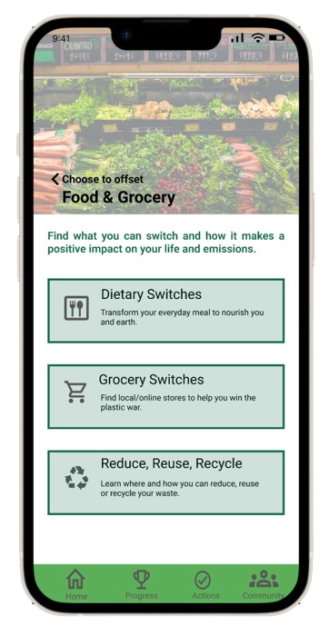
Choose to offset: Sample action screens


Screens: Donate to offset, Actions, Emissions Progress


As pointed above, the tech industry is coming to terms (albeit slow) with the current climate scenario and is taking the steps to familiarize its users.
Narrowing the scope of the problem space: Climate change is a severe problem, and people have been working for years to find solutions. It was necessary to narrow the project's scope to an area where we can make a difference.
Insight-driven rather than process driven: Rather than simply following the same 5-step design process for the project, it is more important to make decisions based on insights gathered from users, stakeholders, and secondary research.
Problem-focused rather than feature-focused: Rather than creating an application with only cool features, the application you create must solve the problem you set out to solve.
It was a challenge to design the content, condense it and make it easier for the user to understand. I would like to work more on the “community” aspect of Carbon Tracker and hope that someday, all this becomes a reality.
Going Forward
What’ve I learned
What Next?
I would like to learn about how AI can play a crucial role in reducing carbon emissions and mitigate the effects of climate change in the field of -
Transportation,
Energy Management,
Renewable Energy,
Industrial processes,
Carbon Capture and storage Technology