

Marleigh’s Floral Design Studio
Marleigh is the proud owner of a local family owned and operated flower shop in Milpitas CA, which specializes in creating beautiful floral arrangements for a variety of occasions. As of now, the only way she has to showcase her work is through social networks like Instagram and Facebook. Her website is currently part of Teleflora network.
The “CHALLENGE” for this project was to design a responsive website that allows -
Users to sort through the inventory and order flower arrangements online.
Create an integrated section to showcase owner’s previous work at weddings/events
To seamlessly integrate owner’s own floral arrangements along with the existing teleflora arrangements.
With the Goal to research the problem space, identify opportunities and improve the experience for current & new users as a “SOLUTION” I redesigned a Responsive website that achieved a remarkable 50% increase in user satisfaction and orchestrated the launch of features leading to a 15% revenue boost.
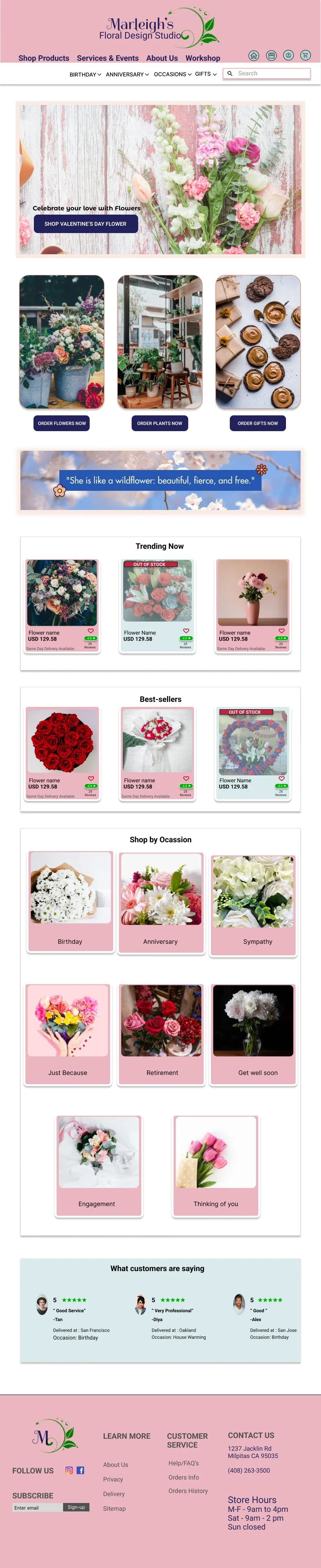
Existing landing page

Redesign proposal - Landing page, Product screen


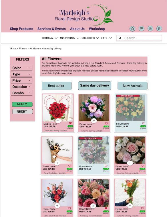
Shop Products home screen at different breakpoints


MOBILE
414px x 896px
Column max width: 400px
Columns: 12
Gutter width: 12px
Column width: 21px
TABLET
768px x10246px
Column max width: 684px
Columns: 12
Gutter width: 20px
Column width: 39px
DESKTOP
1024px x 1024px
Column max width: 940px
Columns: 12
Gutter width: 20px
Column width: 58px
Design Process
Challenge
Clients wants to showcase her products and services to current and potential customers online

UX strategy
Research and compare similar sites, Sketch sitemaps and wireframes, prototype and showcase to client.

UI Design
Defining branding: color, imagery, icons, typography etc.

Responsive web
Design site for different breakpoints including Desktop, Laptop and Mobile

Prototype
Final Desktop Prototype based on user feedback and client input

UX Strategy
The first step taken was to look at her current brand and create a project brief describing the objective, need, and other key elements like the user and feature requirements.
Research

Analysis of Existing website based on User Feedback during 1 on 1 interviews
58%
23%
Overall ease of use
10%
Lack of detailed Information
9%
Difficult finding product
Lack Visual Appeal
Objective
Feature Requirement
The research revealed factors such as:
Need for a seamless and Intuitive check out experience.
Customer reviews
Sustainability credentials on the website,
Brand Trust
Understand the user
• Showcase regular arrangements and bouquetes
• On-line purchase feature
• Showcase of special events services
• Contact flower shop online for special events
“As a flower lover I want to be able to purchase flower arrangements online directly without having to contact the shop” - Nicole A.
Insights
User Pain Points
65% said lack of customization option
Flower enthusiasts feel a lack of control when buying flowers online. The lack of control stems from not being able to customize the flowers themselves.
50% said unclear Information Architecture
Whether buying flowers for themselves or others, users want clear, simple categories which will help direct them to the right products. Users mentioned that they don’t want to spend too much time browsing around.
75% said lack of Description/ Info
Users want a way to buy flowers that provides meaning to the receiver. They want to know more about the product they’re purchasing and doesn’t just want it to feel like ‘an Amazon of flowers’.
The Competitive Analysis helped to identify areas where we can improve, as well as areas where we are excelling in comparison to others in the same industry or market.
The objective of the upgraded website is to bring her current customers to use her new online platform for purchasing arrangements, as well as expanding her clientele and showing off her work at weddings and other types of events.

Meet the Users
The user goals that these personas reflects:
Based on the user research I developed 2 personas that reflect most of the user base of the client. We use proto personas (as we have only assumptions, that we need to validate) to understand user needs and build empathy.

Day-to-day flower buyers want to quickly purchase flower arrangements and get them delivered without having to go to a flower shop.
Engaged couples and event planners want to be able to look through the shop’s website to see previous events and contact the shop directly to get a cost estimate for their event.
Special day buyers want to see season items and buy them directly on the online store and get them delivered without going to the shop.

After creating the personas I designed an interactive user experience by combining the documented user journey with business and user objectives.
User Journey Maps

Site map
After going in-depth to understand the goals of the project and the users it is aimed to serve, I and the client established a good site map for the site.
Based on the user needs I and the client envision 2 main user flows for the app:
Buying a flower arrangement as a sporadic customer
Asking flower shop for wedding cost estimate
Then those 2 main flows were hand-drawn as Paper sketches and further developed into low-fidelity wireframes and prototype for usability testing.
User Flow & Paper Sketches
User Flow 1
User Flow 2
Ideating the Solution
Some “How Might We” questions were created during the ideation stage to help reframe problems and challenges into opportunities for creative solutions. They are designed to encourage creative thinking, expand the scope of potential solutions, and provide a framework for brainstorming and idea generation.


Design- Paper Sketches

Design- Wireframes
The Low-fidelity prototype was tested with potential users and the design was updated based on feedback. All updates were coordinated with the client to be sure we were going in the right direction. Below are some screens of Mid-fidelity wireframes for different screen sizes.


Digital wireframes for Landing Page, Product page, Product detail and checkout

Digital wireframes for Checkout, Payment and Order review
Based on the high-fidelity wireframes and prototype, 5 people participated in a user test of the functionality and design of the Proposed as well as Existing website to ensure its maximum potential.
The Results from the Usability Testing are shown below in a feedback grid of What works well, Needs to change, Questions users have and New ideas or suggestions.
Usability Testing
Users found the website seamless, Intuitive and easy to navigate.
Users liked the ability to look at previous work of the shop in diverse types of events and contact the shop owner online through the consultation form.
Users provided some new ideas like “AI chatbot” that can be incorporated in the design in future.
User Test Insights


Feedback grid for Existing Website
Feedback grid for Proposed Website
UI Design

See below the Responsive Website design on products homescreen from low to high fidelity after the user test!


Desktop screen
Tablet screen
Mobile screen
Hi- Fidelity Mockups
Existing vs Proposed
Existing website product detail page


Proposed website product detail page


Existing Wedding/Events Section


Proposed Wedding/Events Section
Existing Reviews and Ratings


Proposed Reviews and Ratings
ITERATIONS
Ouick Add button is added on product cards to add them directly to the cart
Based on the 2nd usability testing some iterations were done to the final design mockups.

2 New sections of - How it works & Why Us are added to create more brand trust among the users

Weddings and Events are made as separate pages under Services section
Takeaways
Based on the user feedback and proposed solution, the client has decided to incorporate some new features in their website in Phases. In phase-1 the priority zero (P0) changes/insights are added in the current website.
2 prominent feature that client has added are- Search Bar & Online consultation form for weddings/events.


What next?
Based on the feedback given by users and result from usability testing i have proposed to the client to incorporate 2 things in their existing website:
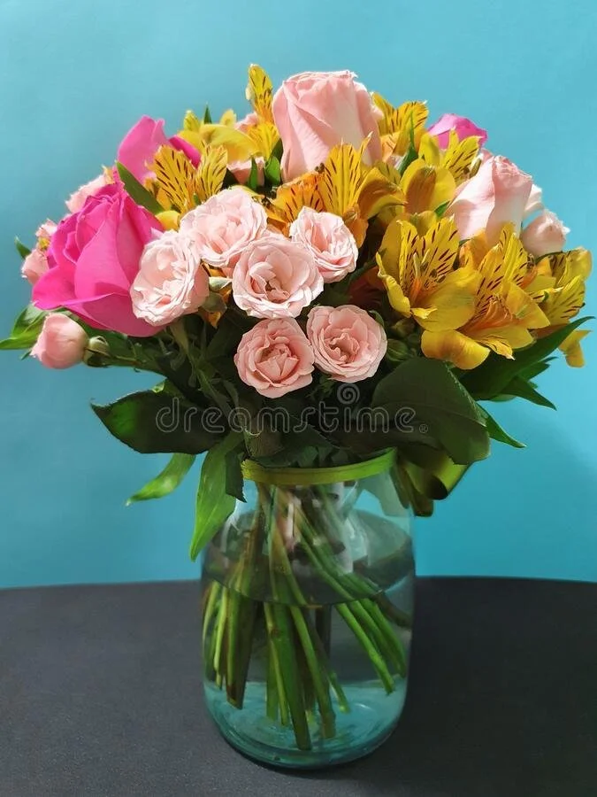
New ideas for floral arrangement imagery. The current images of the floral arrangements on their social media accounts lacks focus on product, neutral background and high contrast.
Another feedback given by most of the users is having a Subscription/Loyalty program, which has been proposed to the client to incorporate in future.


Use of Neutral background when photographing their flowers as well as providing one of their main product images with the view from the top.
Florist can also hold the product while photographing to give a good impression on the size of the bouquet.
Use full color, real product imagery to give a correct impression about the product for the customers.